A Defense—or an Elegy—for the Em Dash

(Photo by satwik arora on Unsplash)

LinkedIn is a realm of nightmares.

Soundcloud rappers turned sales gurus, spitting bars about bagging SQLs. Content strategists lauding the realism of generative AI, meanwhile posting videos of writhing, twitching humanoids defying Euclid’s geometry as they attempt to pet a cat. Newlywed husbands cherishing their seaside nuptials—by musing about how it relates to B2B marketing.

I work in B2B marketing—no, I’ve never married on the beach—and visiting LinkedIn is an unsettling necessity of my job. In the absence of agrarian tasks, it’s my version of shoveling manure. My nostrils are numb at this point to the piles of thought leadership plopping into my feed each morning. But a couple of weeks ago, I saw a post that finally broke my spirit.

Someone was slandering the em dash.

For reference, the em dash is longest of the dashes (—) and my favorite bit of punctuation. A hyphen (-) is useful for compounding words, sure. An en dash (–) is pragmatic for showing ranges, of course. But the em dash? The em dash is rebellious and decadent. It’s the instigator of tangents, non-sequitors, and absurdities. And unlike parentheses, the em dash regards a derailment of thought not as an optional aside, but as indispensable zigzag on an otherwise dull track of semantics. It can even replace the comma for a twist of rhetoric that demands more flourish. It happily indulges every new phrase, no matter how errant or wild. The em dash is a stalwart friend to those of us whose brains can’t think in straight lines.

And according to this LinkedIn poster, it now belonged to robots.

In the post, she said that generative AI models often use the em dash because it’s reflective of existing style guides, whereas most human authors won’t use it, mainly because the keystrokes required to make it are cumbersome. For her, an em dash was like a Voight-Kampff test, a betrayal that the writer behind the words was less organic than robotic. The implication was that, if someone wanted to avoid this perception, they might want to avoid the em dash entirely.

Now, I’m being hyperbolic when I say this is slander, but as a frequent user of the em dash, it necessarily puts me on the defense. I am not a robot, at least not to my knowledge. I could easily be accused of a glitched awkwardness at business meetings and cocktail parties, but I assure you, that’s the result of pure, bio-based neurology. If anything, I’d like to think it makes me more human.

But written text is a mode of communication that I can’t afford for people to misinterpret as robotic. For one thing, it’s my job as a marketer to forge an emotional connection between customers and a brand, something that I hopefully do with integrity—and that I’ve done with no small amount of em dashes in my copy writing. If customers smell the insincerity of a large language model, whether or not I’ve used one, then the bond with the brand is broken, and I’ll need to write a new resume. (Let’s hope no one thinks that’s the result of an LLM, either.)

More importantly, though, writing is my preferred conduit for words in general. As someone who has issues regulating his attention, writing and editing gives me a fenced area to wrangle and domesticate my thoughts—whereas spoken words feel like a herd of wild horses, and I’m supposed to somehow lasso them with Silly String. If people no longer trust the origin of written words, then I’ve lost the craft by which I’ve always felt my thoughts could best be understood.

The em dash is a casualty of the generative AI era, but it’s not the most consequential one, despite my affection for it. The greater casualty is written words in general. This ancient vessel, the word, was designed to float meaning from one brain to another. Porous though it is, it’s still the best method we had for transferring ideas from person to person without those ideas capsizing entirely. And even if those words can be strung together into untruths, you could be reasonable certain before the advent of genAI that those words had embarked from the port of a human mind.

Not anymore. In every medium from printed books to instant messaging, the existence of genAI has drained the perceived veracity of words. There’s no longer a full assurance that what’s speaking to you is human, or if it’s the tortured amalgamation of a million different voices, fashioned by an unthinking algorithm into a vaguely canny echo of one. This unsettling reality leaves us whipping out our magnifying glasses—sleuthing for clues like em dashes—vainly hoping to snoop out the robots so we can maintain the internet as a place of real connection.

I won’t stop using the em dash, no matter how ridiculous the keystrokes. And I won’t stop using my own neural processors to write, no matter how imperfect the results. I’m not a Luddite about LLMs: so long as the results can be reverse-engineered, there is great potential in LLMs as an assistive tool. But to delegate the writing process entirely to them is to deprive ourselves of the reason writing exists in the first place. Writing is a tool that makes us think deeper, dream bigger, reason harder, and feel stronger. It forges minds in fire, and it blazes trails between them.

The more we trust LLMs with our writing, the more we lose than just em dashes. We will blunt the tool we’ve used for millennia to make us more human.

And the more like hell LinkedIn will become.

Does the Jaguar Rebrand Matter?

Nothing gets the internet angrier than a brand changing its logo, even if the brand never mattered to them in the first place.

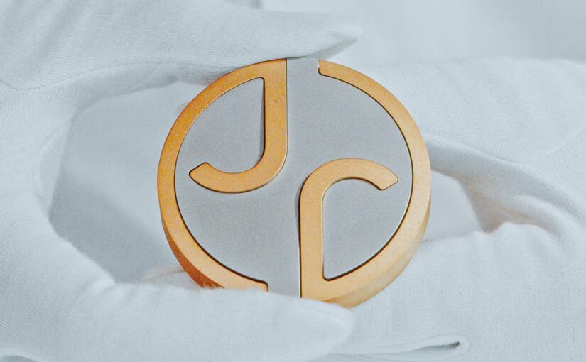
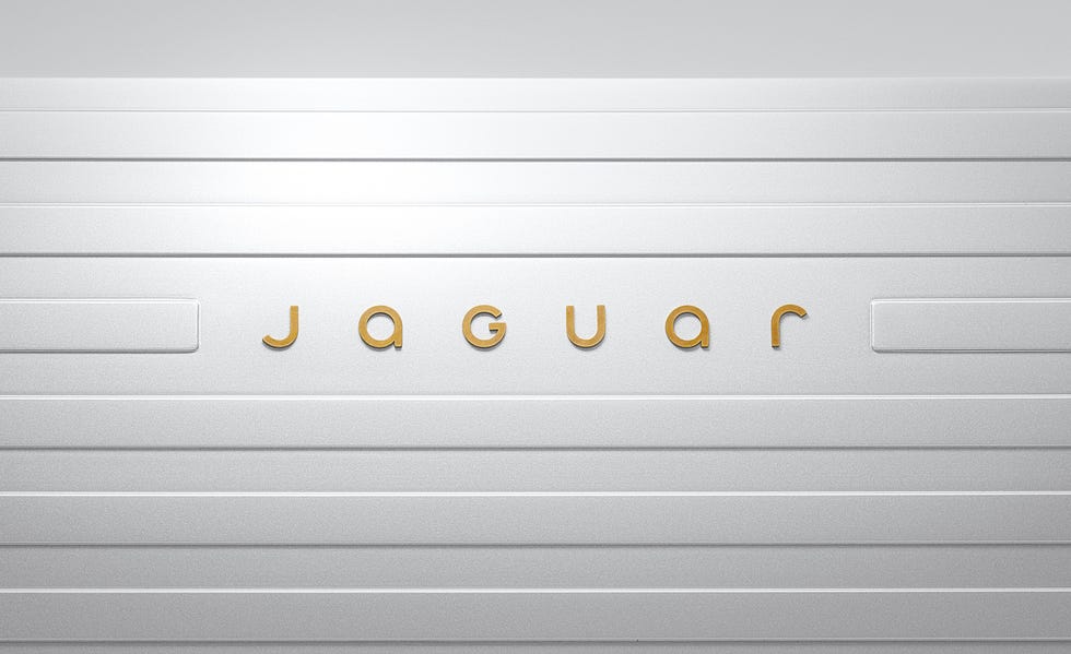
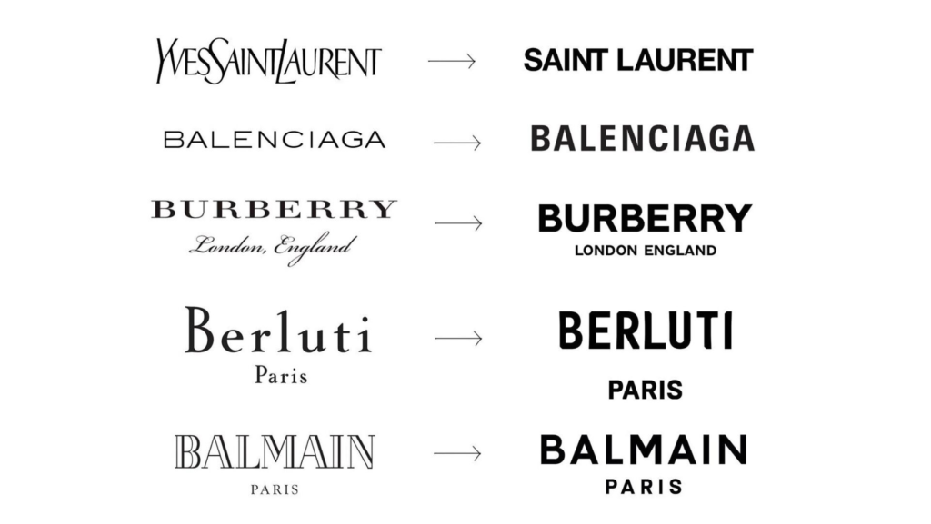
A couple of weeks ago, one of my Discord mods posted a link to Jaguar’s new logo design, hoping to get my reaction. The original Jaguar logo featured an illustration of its eponymous jungle cat with a sleek all-caps word mark in a futurist, wide-width typeface. The new logo has driven its cat to extinction, replacing it with a yin-yang double-J monogram paired with a minimalist, mixed-caps word mark. At first glance, it evokes the era of info-tech more than it does the age of 20th century luxury cars – a clear attempt to shed the stymied aura of old money and invite a new generation of wealth behind the velvet rope.

Like most reactions on the internet to a rebrand, mine was dependably knee-jerk and cynical. “It’s bad,” I said, “and people will forget they ever cared three months from now.” Time will tell if that second part is true, but I quickly walked back the first part of my keyboard curmudgeon statement in favor of something more nuanced.

For one thing, nothing in brand design is good or bad, at least not on a universal scale. Sure, it can fail to meet some practical requirements, like being too detailed for manufacturing or too indistinct for market positioning. But the scales that people use to judge a logo are weighted by culture, experience, and taste – and these vary wildly between individuals. The best one can do is fashion a logo that feels true to the brand’s narrative and tweak it to suit the palate of the target customer.

I will say, the new logo does embody the story of “exuberant modernism” that Jaguar is proclaiming through this rebrand campaign. The subtle defiance of capitalization norms, the occasional diagonal slashes on otherwise right-angled tails, even the absence of the jaguar illustration itself – all of these feel like decisions made to buck tradition with newfound creative energy.

Is this the right move for Jaguar? My guess is, it couldn’t hurt. Like most luxury brands, Jaguar sales have slumped considerably since the pandemic, so it behooves them to at least paint their brand with a fresh coat of innovation, if only for the sake of cosmetics. At least it’ll dominate a PR cycle in time for holiday shopping.

But on the whole, the change leaves me with aggressively shrugged shoulders. For one thing, this ubiquitous move towards bland sans-serifs is just boring. I feel like it started with Silicon Valley juggernauts shaving their logos down to what could be digested on a smartphone screen, and every other industry has felt like they had to follow suit. Maybe it’s the canary in the coal mine of an economy so dominated by tech and finance that every logo feels like it could be for a startup SaaS company.

For another, poaching the illustrated jaguar in favor of a monogram feels like a lateral move at best. I can see the monogram functioning well as an app icon or a hood decal. But there’s another shape that would’ve fit those functions equally well: the silhouette of, you know, a jaguar.

But the biggest reason for my blase is simply this: for most people, a luxury brand is not a purchase but an aspiration. It’s a thing only a lucky few will own, and the rest of us only serve to reinforce its psychological value with others by salivating over it. The new logo deprives the brand of its head-turning feline iconography, draining it of the signaled status its driver wished to convey. And in the end, none of this means anything. Because I’m the proud owner of a 2018 Toyota Camry.

Anyway, see you next time we’re upset about a brand neither of us can afford.

Temples

When I was a kid, I hoped that I would grow temples of white hair like Reed Richards from the Fantastic Four as I aged. I got them — along with a widow’s peak as sharp as a letter opener.

My hair was always wispy, even at its thickest. I buzz it all now. I like the feeling better, not so tussled by the wind or tickling on the scalp. It’s less to manage, less to restyle after being matted down in a beanie during the New England winters.

I’m fortunate to have a nice, round head. It made me a shoe-in for the lead in You’re a Good Man, Charlie Brown when I was in college.

I also buzz it because my hair only wants to fall to one side. The follicles grow like a crew without sea legs, leaning too far starboard and leaving the boat feeling lopsided.

But I miss the white temples, which are translucent with my hair this short. I’m sorry, Mr. Fantastic.

I wonder if I was in a rush for white temples because the people around me seemed to need me to be old more than they needed to be young.

I felt like people needed me to be a Reed Richards. Not just smart but genius. Not just flexible but elastic. Not just durable but indestructible.

When I look in the mirror, I see a shorn head, and I think, ah, there he is. Not Reed Richards.

Me.

Senses

The T-shirt tag that I forgot to cut out. The nice wool sweater I bought that feels like burlap. The jeans that hug my calves a little too tight.

The scrape of silverware in the sink. The hand full of sludge as I open the drain. The clank of dishes as I line them up in the washer.

The alarm in the boiler room of the complex, skimming the surface of audibility through the bedroom wall.

Smacking lips. Dry mouths. The unexpected brush of a loved one’s fingers (I’m sorry).

But hey, there’s also music. So it’s not so bad.